The dark side of Highlights
Time and time again, I've watched videos and read tutorials from other photographers demonstrating how to recover highlight detail (while also protecting their whites from clipping) by decreasing Highlights in Adobe Lightroom Classic.
I've made a few of these videos myself. As a matter of fact, I've applied negative highlights so many times to so many landscape images I've caught myself applying them without questioning why or whether they're even necessary.
No question about it, Highlights is a useful tool for recovering detail in bright tonal areas. However, in my experience, Highlights can sometimes do more harm to an image than good.
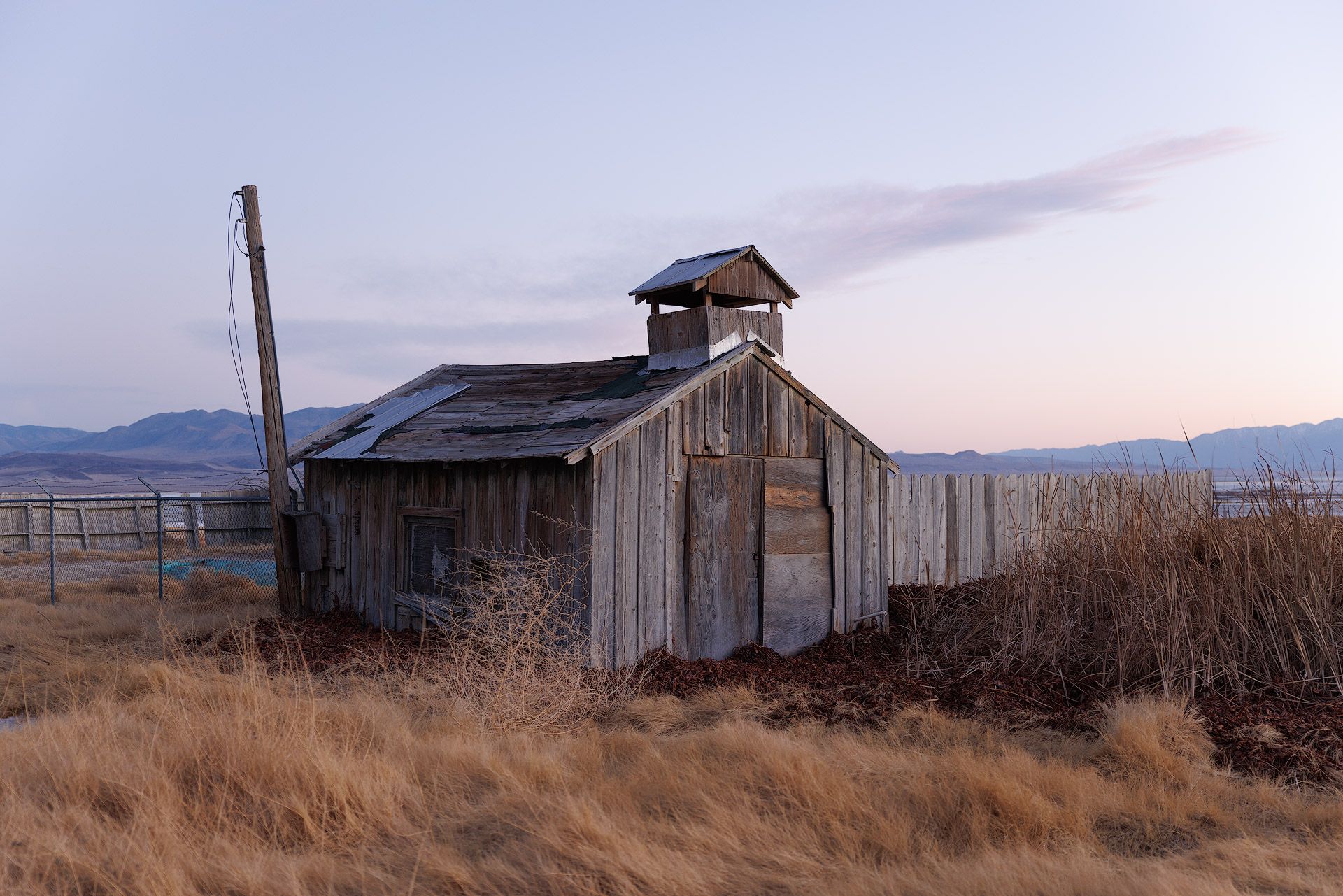
Let me show you an example. Here's a raw file captured using a Canon EOS R5 as seen in Adobe Lightroom with Canon's Camera Standard profile applied.
First, I edited the image the same way I've edited countless images before: negative Highlights, followed by a Contrast bump to push the (now) compressed tonal range back out.
Second, I edited the image without touching Highlights. Instead, I dropped Exposure almost two stops, lifted Blacks all the way to 100% (to keep the darkest tones from then clipping), then raised Whites to stretch the brightest tones back towards the right side of the histogram.
Here are the results side by side for comparison.
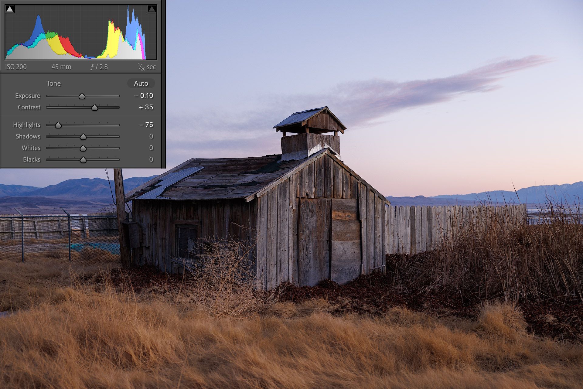
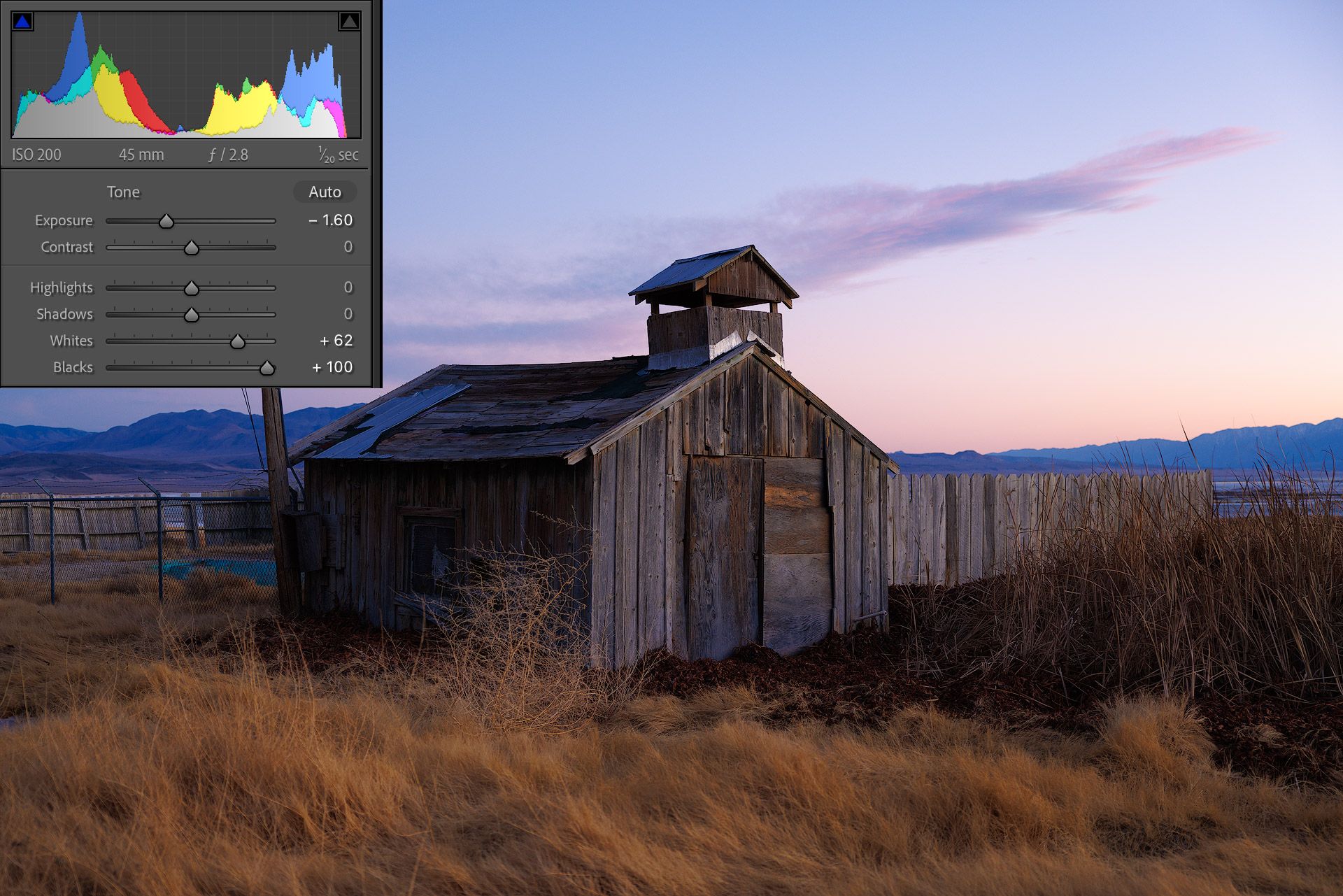
Similar black point, white point and contrast, but the colors in the second image are noticeably denser, deeper and thicker than the first. They feel less like digital and more like positive slide film. The sky is especially different, with more shape and volume compared to the flat, gray sky in the first.
Check out the clouds up-close...
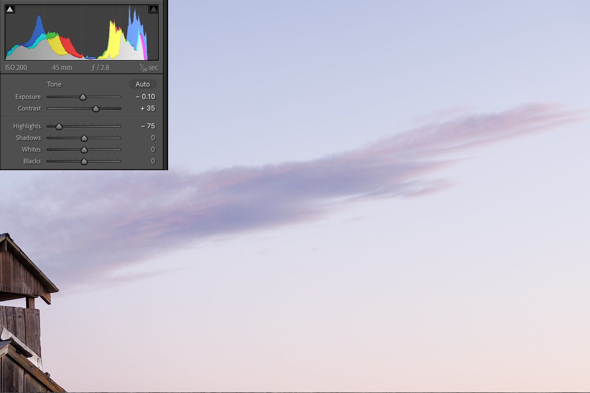
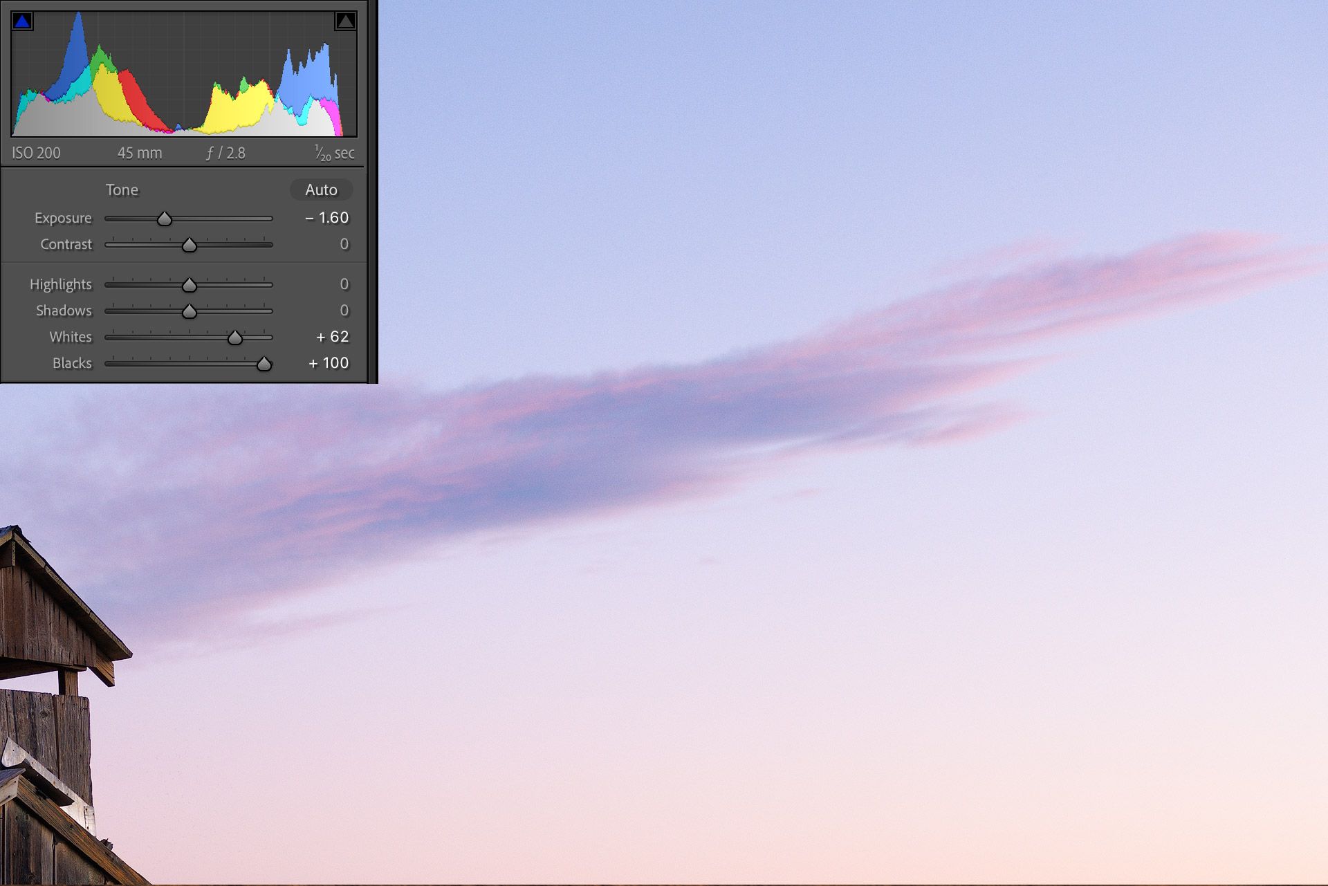
Big difference, right? The clouds with negative highlights look lifeless and empty, while the same clouds in the second image are bursting with bright magentas and pinks (more like how they actually appeared in reality).
Here's why I think there's such a notable difference.
In digital photography, bright tones are less saturated than dark. They simply don't contain as much color information. So when Lightroom compresses those bright tones through the Highlights slider (by moving them further away from white) they lose saturation and turn gray. And when that happens, increasing brightness won't brighten colors. They simply become a brighter shade of gray.
But in the second image, saturation is more luminous because highlights aren't being compressed. Instead, the brightest tones are being stretched and amplified, which in-turn makes the colors richer and more vibrant.
Does this mean the Highlights slider is bad? No, not at all. But I do think the slider may be overused and often used incorrectly (or out of habit) with images that don't need highlight recovery.
My advice? Don't automatically reach for Highlights (or Shadows for that matter either). Try creating a nice tonal balance through Exposure, White, and Black first, then use Highlights and Shadows (and/or the Tone Curve) to fine-tune tonal values when needed from there.
Care to share your thoughts or feedback? Feel free to contact me.
Video
Here's the video version of this article.